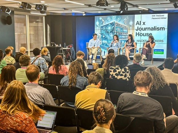
Design Thinking taught by Hong Qu at Hacks/Hackers NYC

The Design Thinking hands-on workshop with Hong Qu, one of the first designers at YouTube, took place at the CUNY Journalism school. It led the attendees through the premise behind user persona testing. Then Hong had us get together with teams and create user persona scenarios and wireframes for 5 ideas submitted by attendees; first on paper, then with Omnigraffle.
The team topics:
- Finding medical price info
- Gourmeet
- Penpal news
- Event sign-up
- Videogames: mobile mall stats page
Hong explained that taking the time to identify users and iteratively build from paper to wireframe and onward minimizes the risk of making something unusable. The foundational step of the design process should be research on the user of the product you intend to build. First step is to come up with probable user personas for your product. Next is interviewing the user you’re targeting your product at in order to understand their life, their goals, and how your product solves a problem in their life.
- Criteria to help identify a user persona, which Hong had us flesh out and even act out in our groups:
- Name
- Age
- Profession
- What kind of computer/tech they have
- Possibly a quote
- Goals
- What primary tasks or goals do they have (i.e what paths are they trying to accomplish with this tool.)
One participant asked how he, as a designer, can know he’s achieved a representative set of persona categories before even testing. Hong explained that while designers may have to just identify something probable and then test the premise, once they begin to test and receive data, analytics logs become immensely useful indicators of visitors’ experience on the site, and of the most prominent tendencies of visitors.
Hong walked us through how he and the team working on the Knight Foundation website achieved the goal of creating a searchable grant platform:
First, he went through the Google Analytics and circled existing pages with the most clicks. “Apply for Grant”, “Contact Us” and “What Are We Not Looking to Fund” stood out as especially hot links, and one of the more popular search terms was “journalism grant”, which lead the team to identify that a lot of visitors were coming to the site looking for information on funding, and pointed to a clear “grant seeker persona” as well as the need to make the “Contact Us” tab more prominent.
This data together pointed to a good opportunity to turn content relating to grants into a searchable grant database platform to allow grant seekers to easily see past projects funded by the foundation. The data driven treatment of user personas provided a useful feedback loop for the designers and allowed for a more accurate and evolving picture of user needs and frustrations over time.
Tools:
- Omnigraffle: “very much like powerpoint but with more advanced tools.” Designers can easily create clickable simulations for their product with html image maps.
- Graffletopia and Konigi: provide handy stencils for user personas, with enough pre-built shapes to design a whole site with, and a big user community with plenty of tutorials on youtube.
- Silverback: records user testing of sites.
- Hong’s wireframing slides
In order to get the most accurate picture of current usability each group had a visiting tester come over and try out the rough wireframes without any context or info beforehand.
Testers then came to the front of the class and answered the following 4 questions:
- How would you explain it to a friend?
- How often would you use it?
- What design elements made impression?
- Tell a story of a scenario in which you would use it.
Useful questions for anyone building a platform, and together with delicious spring rolls and good company, a great evening all around.


