Hacks/Hackers style guide released today

Today we’re releasing the Hacks/Hackers style guide. As our organization continues to grow rapidly with groups across the world (five countries and counting), it’s become clear we need visual brand consistency. We wanted to make it easier for our members to access and create high-quality logos for everything from events to websites to Hacks/Hackers gear.
As our brand continues to grow, we also wanted to explain how we ended up with our logo design in the first place. It may seem basic but as any journalist, coder or designer knows, it takes a lot of work to make things simple.

Similar to how a writer can be too wordy or a developer writes inefficient code, we started off way too complex: gaudy logos, full of gradients and noise.
It never felt right, so we got simpler and simpler.
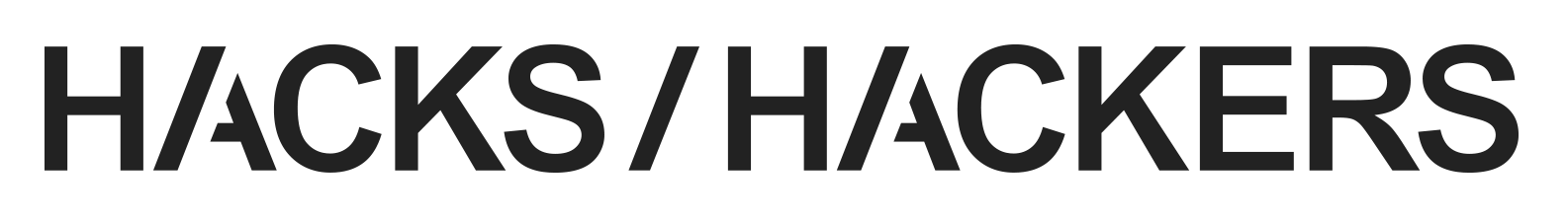
We decided to gussy up the design with crazy, custom fonts, only to find the answer was that clean, elegant, ever-ubiquitous font, Helvetica. At first, we avoided it because it was too obvious. The font is featured in hundreds of logos. There is even a documentary film about it. It’s popular for a reason though: It just looks good. It’s clean and is a chameleon of a font.
Our logo is clean and to-the-point like a well-written article or code snippet. There is elegance in simplicity. But that doesn’t mean there can’t be a bit of flourish or symbolism.
Our brand’s color palette, primarily black and white, is both simple and symbolic. Think newsprint, classic movies, newsreels, watching Edward R. Murrow on TV. Think old computer monitors, command line, playing Atari’s Asteroids at the arcade. It’s a nod to the past, but also to evolution, revolution. Each medium, each technology pushing us farther ahead.
For any digital logo, you need at least three layouts: A square version for Twitter and other avatars, a horizontal version to run across the top of blogs and websites, and a vertical or “stacked version” for other demands, like Meetup.com. In addition, Hacks/Hackers needed a logo that could be extensible, so it be customized for different cities, like “Hacks/Hackers Boston” and “Hacks/Hackers Minneapolis.”

We designed it so the group name could be added in the bottom of the main Hacks/Hackers logo. The one flourish we gave into were sexy ascenders, those parts of lower-case letters like “h” or “k” that reach seductively upward. This idea, provided by Chrys Wu, adds a bit of uniqueness to our groups, the same way each of them adds their own flavor to the Hacks/Hackers brand.
We hope you like our logos.
I’d like to thank Jenny 8. Lee who provided art direction, calmly putting down unfortunate designs along the way, and Burt Herman, who got the process started and provided encouragement throughout the process.
You can download the Adobe Illustrator AI and EPS files here. The files are CS4 compatible. For those without Illustrator, you can download the PDF here. If you have any issues or need other formats, please let me know.
Also, we’re looking for design volunteers. If you’re interested or have other questions my contact info is below.
Find it on Scribd!


