Redesigning Hacks/Hackers
How do you define a brand to represent a grassroots collection of journalists and technologists? For Hacks/Hackers, we knew we needed to approach design from the perspective of both developers and editors, while also welcoming the worldwide participatory community. The end design of Hacks/Hackers needed to connect dozens of global groups, yet be flexible enough to allow each group its own independence and identity.
Design Studio
We started with an internal design studio to kick off a six-week design process. Alley’s design studio format is based on lean UX techniques and helps us gather and prioritize objectives, requirements, constraints, and success metrics. By organizing these into ranked lists, it becomes easier to break down the project into smaller tasks, which naturally results in shorter start-to-build times.
Once we had general project information compiled and formatted into our design studio template, we began a timeboxed brainstorming exercise using video conference, Slack, and collaboratively editing a Google Slides document. The exercise alternates between independent sketching and periods of peer review to merge the best ideas from the group into a unified vision. What we accomplished in a regimented three-hour design studio saved us potentially weeks of back-and-forth among team members.

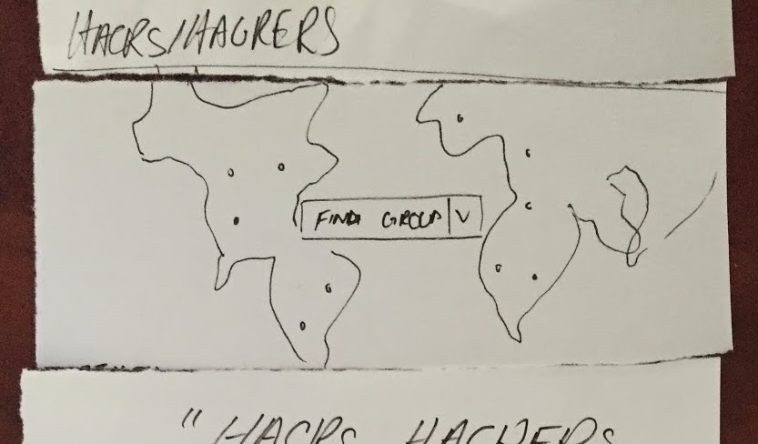
We orient our design studios around a specific user flow or page. Our design studio for the Hacks/Hackers homepage aimed to balance the primary user objective of providing a way to discover groups from around the world with the organizational goal of encouraging peer-to-peer interactions. After gauging level-of-effort vs. impact, we landed on an interactive map that provides curious visitors with a bird's eye view of the larger Hacks/Hackers network along with a way to drill deeper into an individual group.
Logo and Identity Design
We had fun creating the new Hacks/Hackers logo and logomark. The decision to use the forward slash as a focal point was very natural. The challenge came from the dichotomy of its meaning. The forward slash is often used to denote division or contrast but we saw it as a symbol connecting the worlds of Hacks and Hackers. By turning the uppercase A in each word into an abstract representation of that connection, we reinforced that the Hacks/Hackers community is not a choice between Hacks or Hackers, but a welcome mixture of both. In the logomark, we substituted the stem of the uppercase "H" with the "/" so that the mark itself remains unified.
For the identity, we chose the ubiquitous and free-to-use Arial, which gave us the most flexibility as the Hacks/Hackers community grows to additional locations. New and existing groups need to customize their combination mark for use across different types of marketing collateral, from stickers to avatars to banners, and Arial makes that task easier for everyone.
As with the rest of the design process, we opened the logo designs up for community feedback:
Color Palette, Typography, and Style Tiles
Color selection can be tricky when you’re working with a global community because colors can mean different things in different cultures. To address that, we incorporated a diverse palette into the site. The range of cool and modern colors helps each group differentiate itself and ensures scalability without homogeneity as the Hacks/Hackers community grows.
We published proposed style tiles on Github to gather feedback on different typeface and color combinations. Hacks/Hackers community members were able to see our proposed design pairings and offer their thoughts or suggestions before we were too deep into the process. We ultimately chose the bolder Montserrat for headlines, while calls-to-action and blocks of small type use the UI-friendly Hind.
In-browser design
Our choice to use Hugo as our static site generator allowed us to execute our wireframe and prototype deliverables in the browser, thus expediting the overall design process. Having all the files in one place made it seamless to share the prototypes with remote stakeholders on the project and quickly receive feedback on the design direction. Working with Hugo was great.
Hacks/Hackers’s grassroots core became the key visual motif of the site. We were inspired by the requirement that anyone should be able to hack the site directly. We knew we had to incorporate a Hack this Page call-to-action to inform visitors about this feature. This feature also made us aim to keep the design very simple so anyone can update the site’s templates, styles, or content. As a visual flourish, we added a blinking cursor to indicate that it’s the reader’s turn to start writing to the site.
Christa Field is the Creative Director for Alley Interactive. Alley is proud to support Hacks/Hackers, OpenNews, and other organizations at the intersection of journalism and technology.


